Alphabetography M A R S H A L L 2015, Alphabetography, Blog Years, Projects August 8, 2015 P Like Loading... Published August 8, 2015
Oh very good. Is the blur in bottom third to diminish the greenery bottom right therefore making less of a pull on the eye? And where did you find this? Is it ironwork? LikeLike Reply
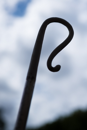
It’s a steel sheep hook on a statue at Charlecote. I had to get down quite low to try and isolate the shape from the bushes behind. LikeLike Reply

Oh very good. Is the blur in bottom third to diminish the greenery bottom right therefore making less of a pull on the eye? And where did you find this? Is it ironwork?
LikeLike
Good image. I like the low angle making the sky the background.
LikeLike
It’s a steel sheep hook on a statue at Charlecote. I had to get down quite low to try and isolate the shape from the bushes behind.
LikeLike
Ah yes I know the one you mean. Hope Janette was there to help you back up!
LikeLike
I was with the boys, and they were no use whatsoever.
LikeLike